HOW / Busy Beaver Button Co.
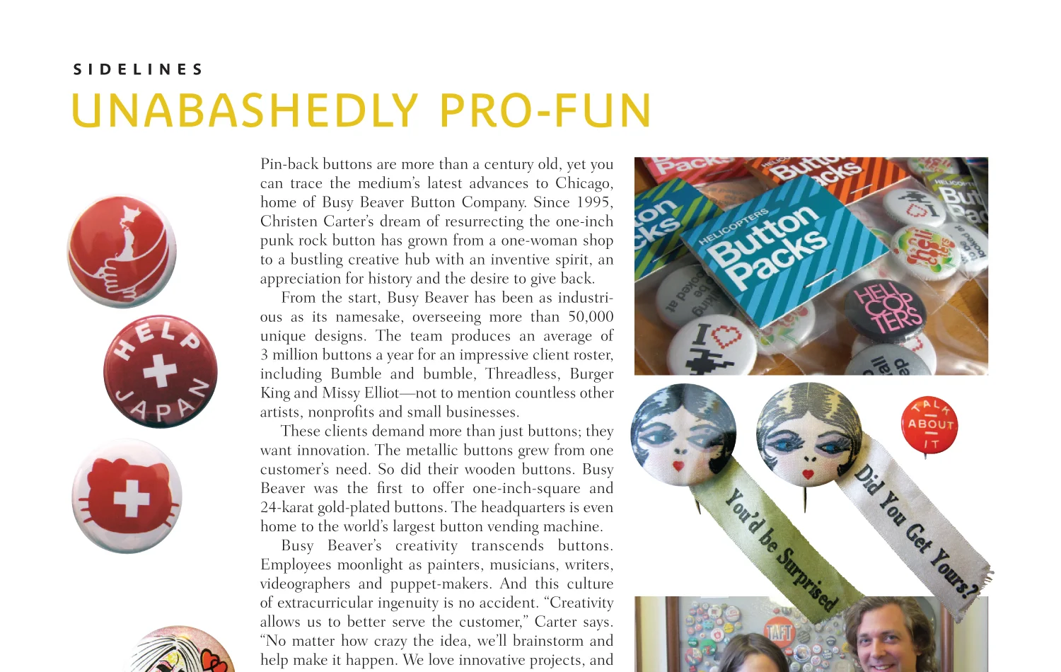
I wrote a Sidelines feature about Chicago’s Busy Beaver Button Co. for the May 2012 issue of HOW magazine. To read the story, click on the link below:
Unabashedly Pro-Fun (PDF file)
An online sidebar originally appeared on the HOW Design website accompanying the print article. In March 2019, HOW’s parent company filed for bankruptcy, and the website ceased to exist. The sidebar now appears below the adjacent thumbnail.
Designing Buttons: 8 Tips from Busy Beaver
Designer Jason Caldeira loves buttons. “They’re just one of those little things that make people smile,” he says. “They’re whimsical, impactive, affordable, and most importantly fun.” Caldeira is a veteran button designer. You can be, too, and now that you’ve decided to make the leap, here are some things to consider, courtesy the Busy Beaver button-makers and some friends.
Think Big
Buttons are a dynamic medium. You’ve got plenty of options, ranging from size to shape to format to color. Want glow-in-the-dark, diamond-shaped buttons? You’re in luck! The sky’s the limit; use your imagination.
Now Think Small
Though you’ve got myriad choices, remember that buttons are a very to-the-point product. You have a limited space to work with and an even shorter amount of time to be seen, so keep it simple. Less is always more.
“My favorite way to work with the buttons is to print one-color (black) on colored paper, resulting in a two-color design,” Caldeira says. “In the same way that the testament of a great logo is its ability to work in black and white, limiting yourself to two colors can often help focus your message.”
Don’t Fly Blind
Busy Beaver offers templates for every type of button they produce, along with detailed how-to files for both Illustrator and Photoshop. Use them. They’re an important insurance policy and will only make things easier for you. And those producing your buttons.
Carefully Consider Color
Use CMYK color builds for your design. Buttons produced using RBG colors will reproduce much duller than their four-color counterparts. If possible, avoid using deep blues and purples, which print much darker than you’d expect. To eliminate trapping, use a rich black (add 30% cyan, for instance).
Consider the Recipient, Too
“I’ve found that the audiences I’ve designed for have been more interested in slightly ambiguous designs that act as conversation starters,” Caldeira says. “When it comes down to it, you want someone to wear your button, and not just shove it in a drawer somewhere. Experiment with materials for displaying your buttons, like backing cards and multi-packs. Sometimes even a big ol’ jar full of buttons is enough to generate interest. Get creative and have fun with it!”
Let Art Work for You
Both vector and raster art perform quite well on buttons. That said, keep raster art at 300 DPI to avoid unwanted pixelation. And never mix low-res raster art with vector art. To avoid further surprises, don’t forget to outline any typefaces.
Practice Safe Production
When designing buttons with a color background, always add a full bleed. If you’re looking for perfectly curved text, combine circles with type on a path. Avoid unnecessary borders, which can potentially make your button look off-center. Keep round art for round buttons and square art for square buttons.
Protect Yourself
Don’t forget to check your spelling, as even one errant letter can turn your funk band into, well, something else altogether. If you can, do a test print of your final design at actual size. You’ll be able to catch things on paper that you may not see on screen.
Follow these simple pointers and you’ll be well on your way to a compelling first project. Something else to consider is pitching buttons to your clients, who are always seeking something memorable. “I’ve designed buttons as premiums at corporate trade shows, buttons for local bands, buttons as promotional leave-behinds, buttons for baby showers — you name it,” Caldeira says. “Buttons can be the perfect medium for spreading your message. Direct mail often gets thrown away. Buttons don’t.”
Their affordability and novelty make buttons quite versatile, too, says writer/illustrator/baker Jessie Oleson. “Buttons are an excellent freebie at events, or an awesome little extra to throw in with big orders,” she says. “People always love something fee, and buttons don’t break the bank. As an item to sell, they’re also effective — people don’t balk at spending $2 on a single button, and the cost to produce is quite low.”
Buttons, says Busy Beaver founder Christen Carter, are just as practical a solution for creatives who sell their own goods. “It’s a good idea to sell some things that you don’t have to make yourself,” she says. “And something a little cheaper, too, so that if someone can’t afford what you make, they can at least own a piece of your art and be able to talk about it with their pals. It’s still hand-made — by us — and still 100% made in America!”

